Comm-Unity App Realisation

CommUnityAppMockUps

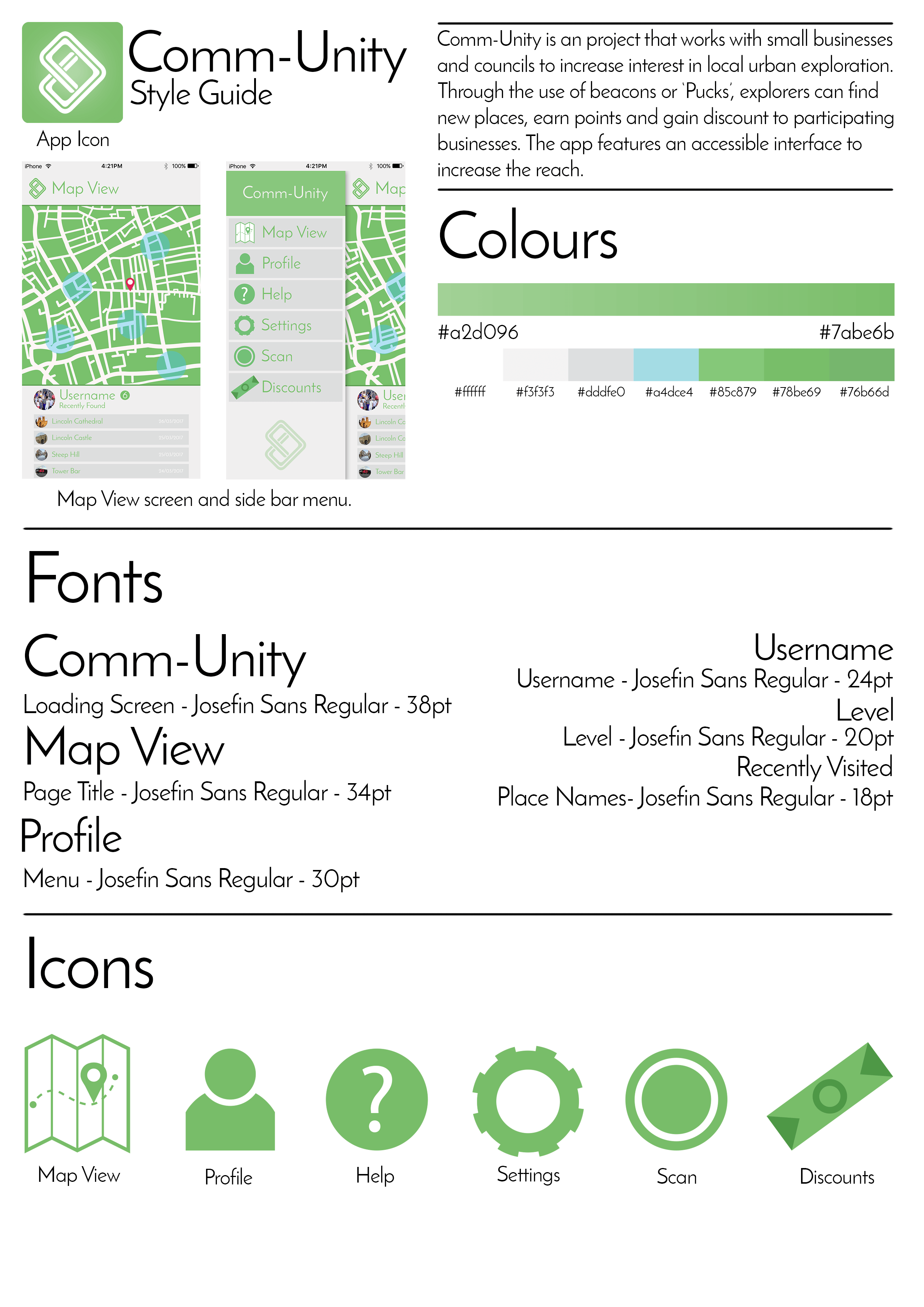
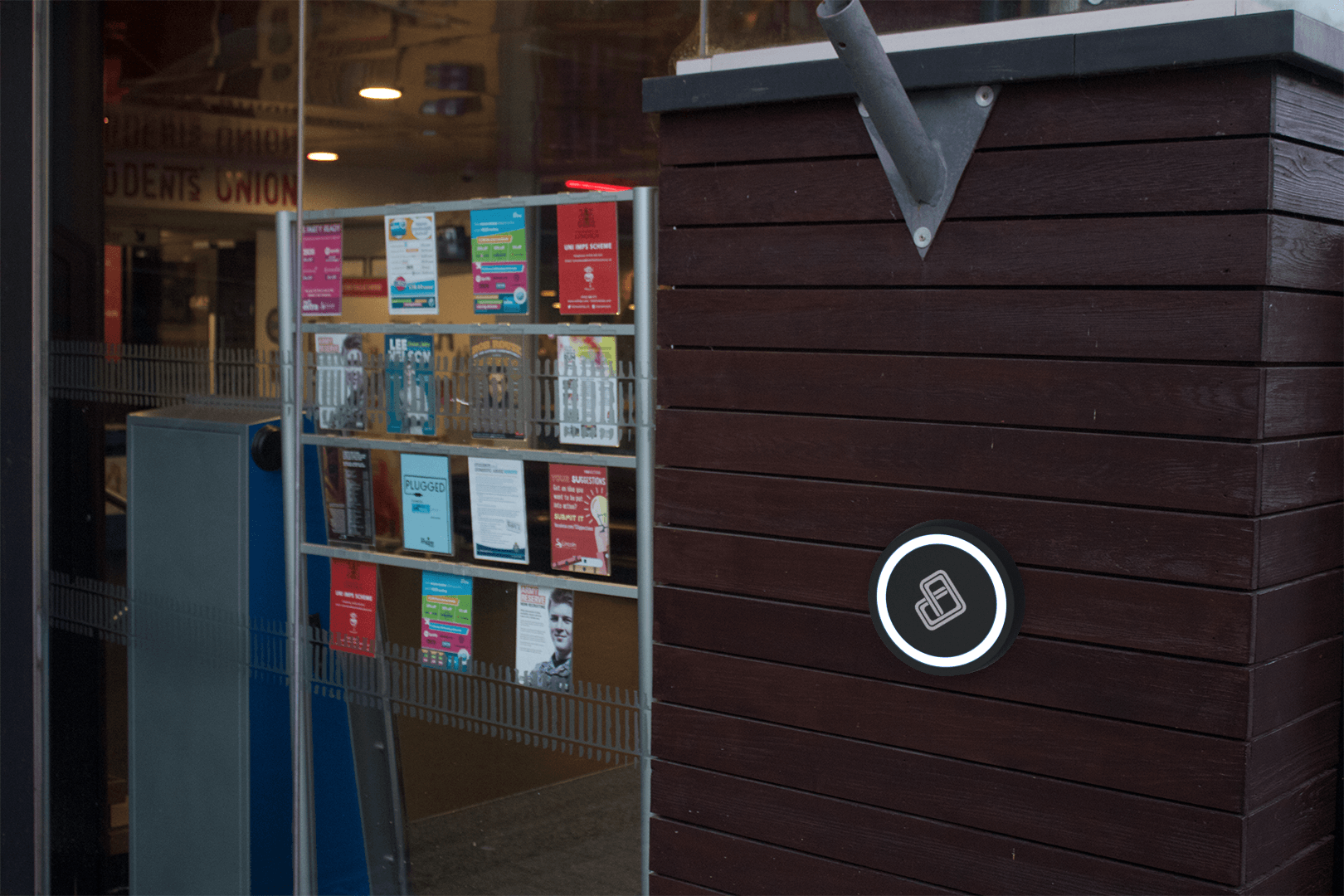
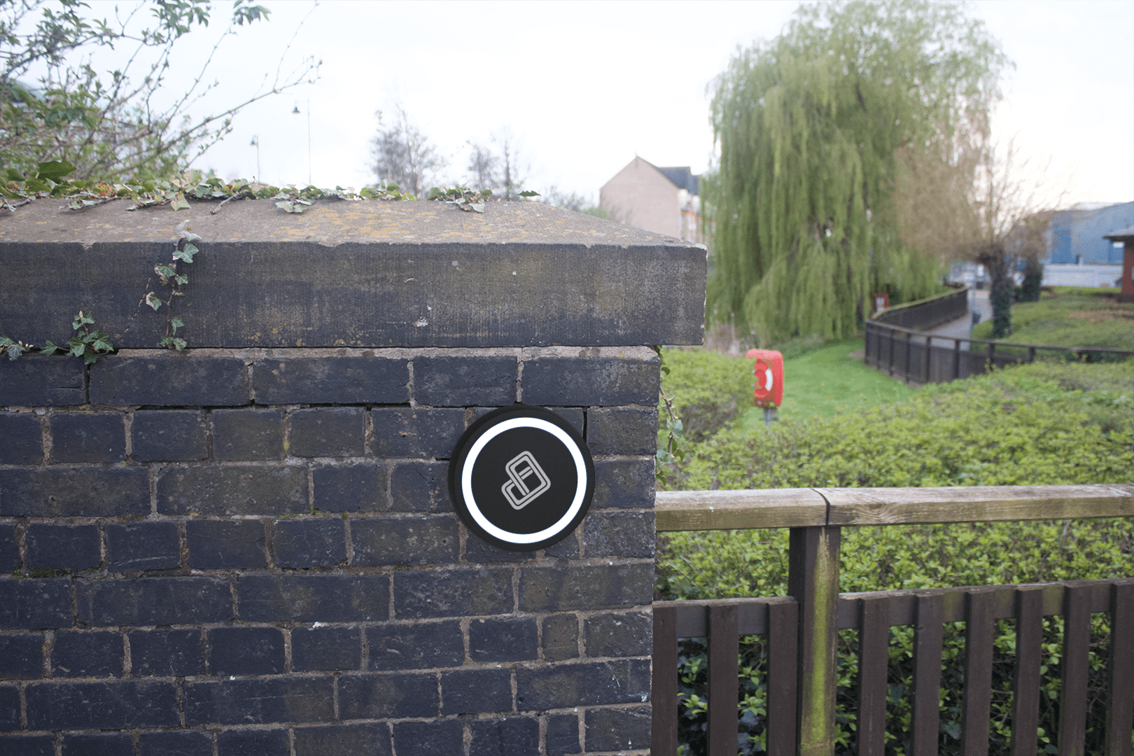
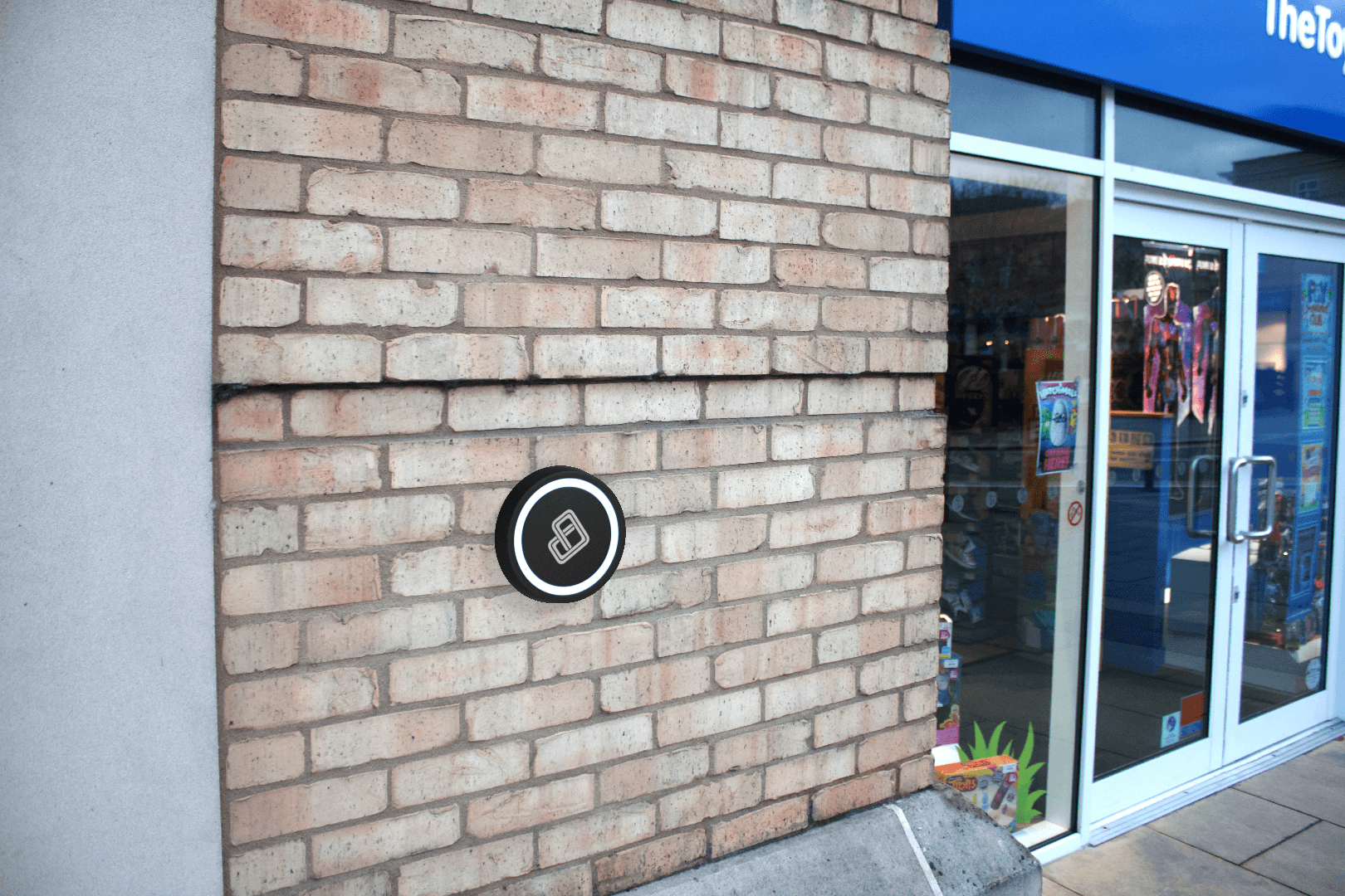
In order to visualise the app in reality, I have taken the screens that I have designed so far and placed them on models of the latest iPhone. This allows me to get a sense of usability and scale for the app on one of the most common phones on the planet. This also lets potential investors get a glimpse of the finished product as it would come when downloaded. Personally, I think that the app works well on the mock ups. The buttons are quite large and clear which means that it would be accessible to a large audience. The use of icons and text again allows for a larger audience for those that can’t read or don’t quite understand the language it would be presented to them in.

Comm-Unity App Style Guide and Icon

CommUnityStyleGuide

Here I have put together a style guide so that should the app be recreated or altered, the core elements of the app are here. Everything from the icons, fonts, colours to the reasoning behind the app and what the project wishes to achieve. Style guides are useful as they provide an insight into the elements and assets that have gone into the project. It also displays how it all looks when it’s put together on the app screen. Keeping the font the same as the app itself provides a clean aesthetic and maintains a house style with the app as well as looking sophisticated and modern much like the ‘Puck’ itself. Shown here is also the app icon in the top left corner which can be seen here:

CommUnityLogo

For the icon, I kept it minimal, using the same gradient as seen on the loading screen for the app. I kept the logo quite large without filling the frame as well. With no writing, the message of the icon is kept clear. As most modern smartphones display the apps name anyway, there’d be no point in adding the name to the icon anyway. The green makes for a welcoming appeal to the app as well as suggesting that the app pushes for a greener solution to local transport and exploration. The simple shape of the logo mixed with the subtle gradient provide a clean aesthetic reflective of the app itself.

Comm-Unity Puck Realisation

SUPuck

ParkWalkPuck


ToyShopPuck

ZingPuck

So taking the model for the Comm-Unity Puck from Blender, I’ve used the programme to provide some mock-ups of the pucks being placed within reality. This allows for potential funders to see what the product would look like once completed with customers purchasing the product and placing them on their businesses. It also allows a look as to how the aesthetic fits within the modern day world, if it looks modern then it would be more widely accepted within society whereas if it looks out of place and outdated then people would be quicker to ignore the product. Personally, I believe that the product fits with modern day architecture as well as providing a nice contrast with older architecture. It looks fairly futuristic and modern, something quite small so that it’s not an eye-saw to people and it doesn’t feature any aggravating or provoking imagery so in general is a none offensive piece of technology. I think that with the additional colours as well, it would add a bit of colour and cheer into an otherwise grey and beige world which would also entice younger audience’s or families to get involved and go exploring.

Comm-Unity App XD Mock-Up

Adobe XD Mock-Up

I have now put together my conceptual mock up for my app. As it is, I’ve only made a few screens for the app just to display some of its key functionality. So from this, I’ve shown what the main screen would display, the home/map screen, as well as the scan screen for the puck. I think that this video displays the design of the app and the art style I’m going for quite well. It also shows the utility and usability of the app and how easy it is to interface with the app and it’s reasonably intuitive design. The main thing I was looking for with this was that the design would be usable for the average consumer. This would increase the reach of the app and allow for the app to be much more accessible.

Comm-Unity Puck Conceptual Designs

PuckConceptualDesigns

After a few weeks with blender, I finished the conceptual designs for the Comm-Unity ‘Puck’, a beacon that utilises the NFC chip within modern day wireless technology to access certain information. For the design, I found that a circular puck provided a nice aesthetic that would be pleasing to look at for many people interacting with the device. The ring LED also makes for a welcoming look rather than looking like a solid plastic case with a logo on it. Should this go into production, the casing itself would be made out of a matte plastic that can come in a variety of different colours. This keeps it contemporary and appealing to a younger audience. The LED ring would be made using a thin, semi-transparent material that allowed the lights to shine through. These would be able to be mounted anywhere by anyone, however, the issue of mounting the product would be addressed once this project gained more funding. Keeping the look to a minimum keeps the clean and modern aesthetic and doesn’t seem overloaded with information and buttons.