App Design Research

When it comes to app design, it is important to look at what’s already out on the market as this will allow the designer to consider current trends as well as think of possible ways to establish new styles and trends which would set the path for others to follow. With recent design, there has been a shift away from the utilitarian much the way that Jonathan Ive lead Apple to base their app icons on the device that said app would replicate. This has since been replaced with a more flat approach to design, something a bit more timeless with elegance and sophistication. The colours used are a lot more muted rather than being bold and brash, the gradients are warmer and cleaner rather than deep and overly complicated. This can be seen below with some mock-ups for a project called Listeners Playlist:

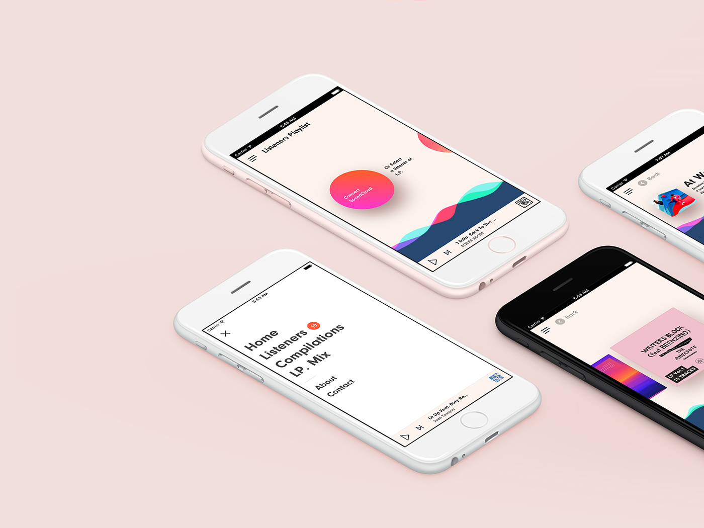
Keeping the colours to a minimum helps keep the shapes clean and the edges sharp. This really benefits the user as it means that less information is lost in the confusing appearance of a UI. People are able to get the information they want instantly without confusion and progress on with their lives quickly. Some may argue that this approach is a bit childish, plain and boring, however, I’d say that this is definitely a step in the right direction and something I should follow when it comes to my design.

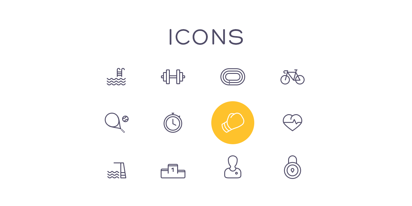
Something to consider when designing an app is legibility so keeping words to a minimum is incredibly useful, as well as this choosing the right font with appropriate spacing between lines and letters can make all the difference. As people may be of different reading capabilities, it’s also important to establish icons as they would help someone should they not be able to read. Clear icons that portray either a simple visualisation of the connected material or are already universally accepted make for a much more approachable interface.


Encouraging Fitness

Seeing as the app is meant to increase interest in and encourage local exploration, it can also be seen as a route to get young people outside and active. As many of the places the beacons would be placed would be indoors, the usage of bike or walking would be encouraged meaning an increase in physical activity. According to a recent study conducted by the U.S. Department for Health and Human services, only a third of children are physically active each day. This is likely linked to the ever growing numbers of game consoles purchased, as they increase, children are more inclined to play the latest games rather than to go out and enjoy the world. This is something else that the study found, children now spend over 7 hours in front of screens daily and whilst people would be involved with screens with this project it would still encourage people to be outside doing something. Something else found in the study is that roughly only five percent of adults get the necessary thirty minutes of exercise daily, this can lead to cardiovascular and weight issues. Again, something so much as riding a bike or walking to the nearby shop can keep people on their feet and active. Given that the project doesn’t necessarily follow a target audience, people of all ages would be able to use the app certainly as more than eighty percent of people do not meet their required amount of fitness and muscle building activity.

U.S. Department for Health and Human Services’ study

The British Heart Foundation ran a similar study that looked into time spent both engaged in physical activity as well as time spent in a sedentary state (a state of inactivity outside of sleeping). The study found that 44% of Males aged 16-24 spent six or more hours in this sedentary state on average, as well as 42% of women in the same group spending six or more hours in a sedentary state. Even though those numbers may seem quite high, 83% of males aged 16-24 met the recommended weekly amount of hours spent in physical activity, this paired with the 57% of women in that age group shows just how many people in the population are meeting the required amount. Obviously, there is still room for improvement.

British Heart Foundation Study

The NHS warns of the dangers of being seated for too long in a day as it’s considered to slow down people’s metabolism which can lead to issues regarding blood-sugar levels as well as increase blood pressure. A slow metabolism can also mean that people don’t have the necessary fitness to break down fat modules quickly. These can lead to diabetes, heart problems and obesity all of which are problems within modern day society as seen within the U.S. DHHS’s study as seen above. Whilst you may not be looking at a screen whilst sitting, the effects can be just as lasting.

NHS Recommendations

Geocaching

Geocaching is a fairly old activity now which involves leaving a physical capsule for people to find and add to by only providing a select amount of clues and directions. Looking at the modern day adaptations of this with the use of smartphones and technology, this has become easy. Users can select where they want to go and the compass leads them there. Comm-Unity would maintain a sense of mystery by only providing the broad area of it. With Geocaching, many of them are out in the middle of nowhere so may be difficult to get there. That’s something that this project would avoid by placing the beacons in businesses and points of interest people would be able to find and explore places around them whilst improving the local economy. Geocaching has proved popular over the years despite it being still relatively unknown to the masses. With Comm-Unity, people would be able to access information such as reviews, photos, social media or general information on their smartphone, thus, distancing itself from Geocaching. Also given that many of the Comm-Unity Pucks would be placed in shops or in urban areas there would be less risk of danger as there’d be plenty more safety precautions as well as people around. Geocaching often involves people checking in in a log book, this could be something else that I look into as it adds a sense of community to the project.

Geocaching Homepage

(Image showing Geocaching’s Map of locations.)

Pokémon Go

Pokémon Go hit the Apple App Store last year to one of the largest launches for an app ever. The launch was so successful that Nintendo stock skyrocketed despite them having no hand in the game’s production besides the licensing. The app utilised the phone’s location services to allow users to go outside, explore and catch Pokémon. The game got many people, old and young alike outside, exploring. It’d be easy to identify people playing the game as they’d often walk around, phone in hand and eyes down. This actually lead to one of Pokémon Go’s main problems. People were so involved with their screens that they forgot about what was going on around them. There were many reported cases of people walking out into roads or dangerous environments in order to catch certain Pokémon. Seeing as my proposed app follows a similar plan, it’s important to realise the pros and cons to an app like this. The app caused mass hysteria with people going near mad to level up and “catch them all”.

Many heralded the app as being something that finally got kids back outside, however, the app’s popularity was short lived as things such as the whether or private areas prevented people from exploration. Where my product would get around this would be that the beacons aren’t randomly generated, they’re set up manually in public and private spaces. This would mean that access would be required to the beacons and there’d be no risk to the users. The Guardian described Pokémon Go as “Not a good game but a great experience” going on to say that the reason it succeeds is due to the exploration part of the app.

“The real fun, though, comes from heading out onto the streets to see what different sorts of Pokémon having been lying low in the rustling grass of local neighbourhoods, or at various historic sites.”

In a general sense, this is what the focus of my project is, urban exploration. Encouraging this would do wonders to the local community and economy as well as health benefits for all.


Semester Two: Week Eight: Indesign Structuring

In the workshop this week, we looked at InDesign Structuring and layout design for the benefit of our R and D file. We looked at an existing magazine page from Vertex Magazine. The design is very much of its time, it has not aged well and is very difficult to read. The graphics just maintain an ugly aesthetic and make reading the page even worse. The article discusses an indie game and features a screen shot from the game. This has been placed in a window as big as the logos at the bottom which creates a distracting layout.

Vertex Page 8 - Original

With skills learnt during the workshop, I then recreated the magazine page to look a little sleeker and give it a much more lasting appearance. I started by giving the font a hierarchy through the usage of colour and font size. This then creates a leading order for which the reader has to follow. I also dropped the complicated background texture and replaced it with a much sleeker white and grey. I broke the text into two smaller columns for better readability. Changing the font into a much more modern serif font also allowed for a cleaner look.

GoingIndie