Semester Two: Week Seven: Budgeting

Screen Shot 2017-04-02 at 23.55.04

In this workshop, we looked at budgeting. As we’d be pitching this to potential customers, it’s important to know how much of a budget we’d require to complete the project. I looked at the digital and media side of the budget rather than the full budget for the film. Taking the project further would mean a look into the manufacturing costs of the product itself however that would be handled by a separate party. We did this so that we gained an understanding of Union rates as well as the importance of knowing a budget before going into a project. For the budget, I looked at breaking down each of the projects I hope to undertake to clear things up and so that I’d know exactly who and what is needed to complete the project. For the App Design and Development, I decided on setting myself a budget for that as App Design and Development is something that I find relatively straight forward and so would be able to save money on the project. For things such as 3D modelling, I’m not too well-versed in and so don’t feel confident to undertake such a project myself.

Semester Two: Week Six: Gantt Chart and Time Management

Screen Shot 2017-03-06 at 16.47.20

This week we looked at structuring and planning the rest of our time for the project. With this, we looked at creating a Gantt chart which provides a visual representation of the time we have for the project and the tasks we want to have finished and when we want them done by. Considering what I actually need doing then allowed me to think of what jobs they can be broken down into and allow me to structure my time and fill out the Gantt chart. Looking at it with this Gantt chart seems like a lot of work, and it is, but it means that I can break down and focus on different parts of the project each week until it all comes together in week twelve for the submission.

Although it would have been more beneficial to have done this shortly after starting the project, it still means for a cleaner approach moving forward and means that I can see what I need doing and for when and I’ve tried to not allow for too many tasks at any one time, this should mean that I can stay on top of things and shouldn’t find it too stressful.

Semester Two: Week Five: Art Style and Branding

This week I looked into settling on the art style for the project. I believe that the different finished projects should all share a similar aesthetic as this would link them together and create much more of a house style. Looking at trends within illustration it can be seen that simple shapes and flat illustration has been an ongoing trend since people started designing. It’s more the shapes and space of the design that change over time.  One of the more prevalent design styles over the past century has been the Swiss Design Style, artists such as Armin Hofmann have really pioneered this style with its use of angles, space and simplistic shapes to achieve a unique design style. When looking at it, you can see the use of dynamic shapes and sharp edges, it creates a sense of movement or directs the viewer’s eye towards a certain part of the design.

ArminHofmann1ArminHofmann2SwissStyle1


From here I then looked at contemporary trends within design and found flat design styles to be leading the app and motion graphics. Because of the use of simple colours and graphics, the designs have an ageless appeal much as the flat designs of the past century have. Apps such as the immensely popular, “Dumb Ways to Die” have utilised this in the past and set the way for many apps to follow. The app itself was spawned off of an animated campaign to raise awareness for train safety in Melbourne, Australia’s Metro train system. The campaign was massively popular with it’s animated graphics and catchy song. The app itself was a game based on the dumb ways to dies following the same art style.

Looking at this has given me a good idea as to the art style I want to carry into my branding, app design and the style of the motion graphics. I think that if I want something to have a lasting appeal that maintains a contemporary look then a flat art style is what I’m going to follow. Using illustrator, I can recreate this style reasonably well and utilise it for my own projects.

Logo Conceptualisation and Design

CommunityLogos


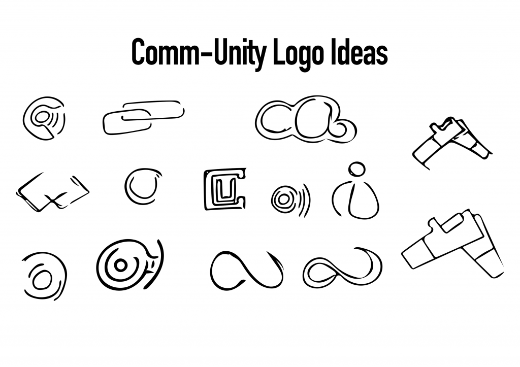
Following the research into logo design, I set up on designing a logo for myself. For Comm-Unity, as the name would suggest, it’s about linking local communities. Because of this, I started looking into potential signifiers of this. I looked at hands held, supporting one another as well as a linked chain which finds it’s strength through its links. I also considered the whole online database factor of the app and so considered the cloud, however, I feel like clouds have negative connotations of rain and sadness. Seeing as one of the products I wanted to make was a physical ‘beacon’, I based it around that, with a C and a U formed around the central node and then the wireless signals and information being emitted from it.

CommUnity1

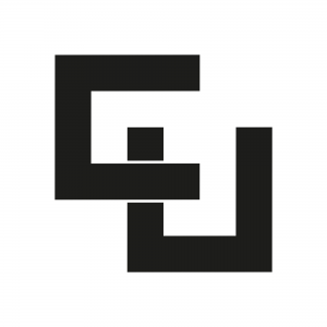
One of the designs that stood out most was this one, which I have since realised in Illustrator. After asking some of my peers, they also agreed that this was the cleanest one and most visually appealing. I’m inclined to agree. The clean shapes and sharp edges provide a modern and sophisticated appeal whilst also maintaining a symmetry which keeps the design balanced. With the overlay, it appears as though it’s two objects, linked together or unified.

CommUnity1(2) CommUnity1(3)

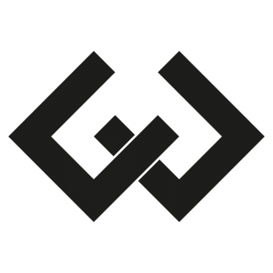
It actually started by forming a ‘C’ and a ‘U’ which were then rotated to form the symmetrical balance of the logo. Something about it though felt quite off, almost as though it was too aggressive with the straight edges and sharp corners. It also felt like it was lacking something, almost as though the design itself was quite lazy, I just didn’t think it fit the message of the project. That being said, parts of this can be seen within the final logo:

CommUnityLogo1

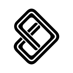
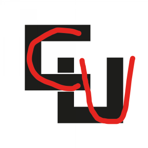
As you can see here, the C and the U are more prevalent, however, they have been linked together and rotated the other way in order to form and arrow, a signifier of both direction and progression, two of the objectives of the project itself. As well as this, I have rounded the corners of the logo which provide it with a much more welcoming look. In order to break up the box look of the logo, I added a line in the centre of the path which splits up the logo and makes it appear as though it were a road or a trail, a signifier of travel and exploration, the main focus of the project.

Logo Research

LogoSheet

When designing a logo, it’s important to consider contemporary trends with logos as recognisable brands establish the trend across the world. They wouldn’t be recognisable without staying contemporary. Many of the logos seen above are some of the leading companies within their field more than likely wouldn’t be there without a recognisable logo. The logo itself would be seen on multiple products such as an app, a physical device as well as any other branding platforms.

Google_Play_logo_2015


I quite like the Google Play logo as I think it’s quite simple yet gets the point across. It features a grey version of the standard Google logo with the word Play attached which I believe to look quite clean. This is then positioned next to an icon that is widely recognised as a play logo. This then allows the audience to see it and automatically know what Google Play is about, a platform to watch, play and listen to media. The colours look clean and make for a satisfying view of the colour spectrum, this could reflect on the wide variety of products that Google Play has on offer.

BadLogo


Looking at this logo for the Instituto de Estudos Orientais, customers may naturally have a negative response to it. The image is suggestive of something inappropriate for younger customers. The logo actually shows a building with a curved roof similar to those found in Asia or the Orient. This is positioned in front of the red sun of the east. With this colour scheme being similar to those found on the Chinese flag. The logo does, however, show symmetry which could be seen as a good thing however in this instance, this isn’t the case.

LogosWithoutWords


As seen above showcases some well-known brands without the wording on the logos and them reduced to their fundamental values. This shows the power of branding as many customers would recognise these brands without the words. This also highlights the use of shapes and colours. Personally, I prefer less words and more focus on the shapes as I think that something works better if it’s instantly recognisable. Taking the time to read just distracts from the art and often makes for nicer designs anyway.