
When designing a logo, it’s important to consider contemporary trends with logos as recognisable brands establish the trend across the world. They wouldn’t be recognisable without staying contemporary. Many of the logos seen above are some of the leading companies within their field more than likely wouldn’t be there without a recognisable logo. The logo itself would be seen on multiple products such as an app, a physical device as well as any other branding platforms.
![]()
I quite like the Google Play logo as I think it’s quite simple yet gets the point across. It features a grey version of the standard Google logo with the word Play attached which I believe to look quite clean. This is then positioned next to an icon that is widely recognised as a play logo. This then allows the audience to see it and automatically know what Google Play is about, a platform to watch, play and listen to media. The colours look clean and make for a satisfying view of the colour spectrum, this could reflect on the wide variety of products that Google Play has on offer.
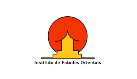
Looking at this logo for the Instituto de Estudos Orientais, customers may naturally have a negative response to it. The image is suggestive of something inappropriate for younger customers. The logo actually shows a building with a curved roof similar to those found in Asia or the Orient. This is positioned in front of the red sun of the east. With this colour scheme being similar to those found on the Chinese flag. The logo does, however, show symmetry which could be seen as a good thing however in this instance, this isn’t the case.

As seen above showcases some well-known brands without the wording on the logos and them reduced to their fundamental values. This shows the power of branding as many customers would recognise these brands without the words. This also highlights the use of shapes and colours. Personally, I prefer less words and more focus on the shapes as I think that something works better if it’s instantly recognisable. Taking the time to read just distracts from the art and often makes for nicer designs anyway.
Leave a comment