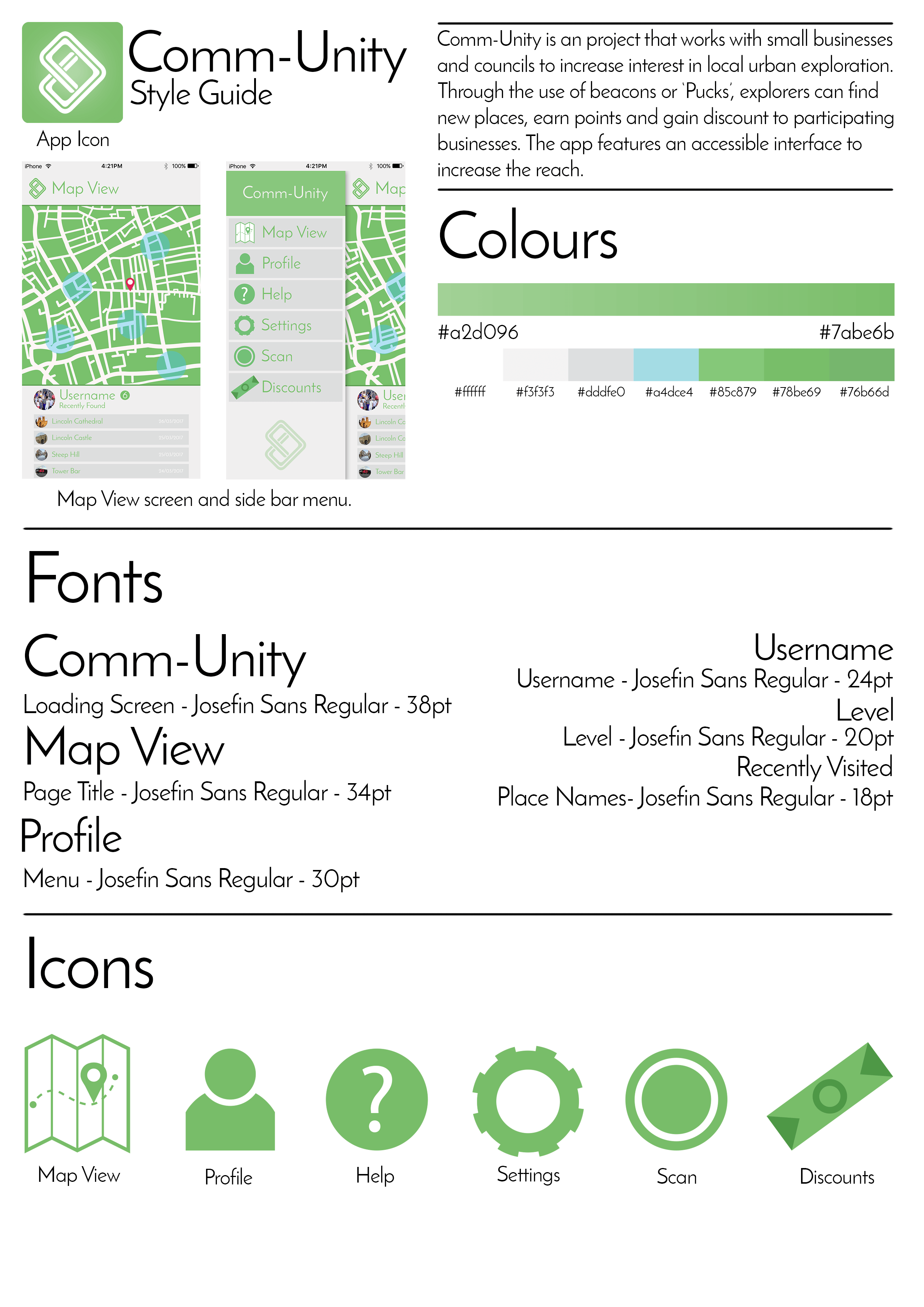
Here I have put together a style guide so that should the app be recreated or altered, the core elements of the app are here. Everything from the icons, fonts, colours to the reasoning behind the app and what the project wishes to achieve. Style guides are useful as they provide an insight into the elements and assets that have gone into the project. It also displays how it all looks when it’s put together on the app screen. Keeping the font the same as the app itself provides a clean aesthetic and maintains a house style with the app as well as looking sophisticated and modern much like the ‘Puck’ itself. Shown here is also the app icon in the top left corner which can be seen here:

For the icon, I kept it minimal, using the same gradient as seen on the loading screen for the app. I kept the logo quite large without filling the frame as well. With no writing, the message of the icon is kept clear. As most modern smartphones display the apps name anyway, there’d be no point in adding the name to the icon anyway. The green makes for a welcoming appeal to the app as well as suggesting that the app pushes for a greener solution to local transport and exploration. The simple shape of the logo mixed with the subtle gradient provide a clean aesthetic reflective of the app itself.
Leave a comment