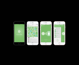
In order to visualise the app in reality, I have taken the screens that I have designed so far and placed them on models of the latest iPhone. This allows me to get a sense of usability and scale for the app on one of the most common phones on the planet. This also lets potential investors get a glimpse of the finished product as it would come when downloaded. Personally, I think that the app works well on the mock ups. The buttons are quite large and clear which means that it would be accessible to a large audience. The use of icons and text again allows for a larger audience for those that can’t read or don’t quite understand the language it would be presented to them in.

Leave a comment