Comm-Unity Initial App Designs


Here I have the initial designs for some of the app screens and logos as well as possible information and options for the menu within the app. With more time, I’d like to leave the option open to continue the progress of the app so although I may not get all of this done for the deadline, I would like to have the option to continue this. I think that the app uses a very simple design that would allow me to provide an accessible and easy to use app that people would find easy to use and relatively simple to interact with. Keeping the design simple broadens the target audience and allows for a better app lifespan.

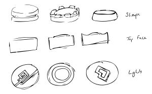
Comm-Unity Puck Initial Designs

PuckInitialDesigns

When I started designing for the puck, I thought of its shape and how it would look in person. I immediately thought it should be circular and none threatening. People often dislike sharp edges and corners on things and so the round edge would seem more friendly. I’ve already started to work on 3D model of the device using some of these designs and have ended up going for something quite simple, the basic round edge on the top right, the first on left of the top face and the middle light. Some of the design ideas seen here just look either too complicated or too intimidating and aggressive. Planning it out definitely helped with the process as it allowed me to pre-visualise before I sunk my teeth into Blender to 3d Model it.

What is NFC? (Market Research)

NFC or Near Field Communication is a new technology that is slowly entering the market and has already seen use on the newer models of the iPhone with Apple Pay. What it allows is for authorised devices to connect with one another if they are in close proximity. The technology itself is an update on the already existing RFID chips or Radio Frequency Identification chips. NFC is limited to about four/five inches which is perfect for what I’m proposing with the Comm-Unity project. This means that people have to be involved and actually find the beacons themselves rather than passing by and gaining access to the data. With NFC, a connection is established once the device is close to it, meaning that where Bluetooth has to be manually searched for and paired, NFC does it in a much more easy and accessible way. As it is currently, Apple only utilise the NFC chip for payments, it doesn’t actually shift data in any capacity. In order for my product to work on Apple devices, Apple would need to open this up and allow for a much more accessible version of NFC, something that can be developed for. Besides this, certain Android devices use NFC to transmit data as well as making payments meaning that it would be relatively straightforward to develop for. That being said, it would be hard to push for a project on this scale without utility on Apple devices as currently they still maintain the largest portion of the market. If the app was exclusive to Android, more phones would be able to access the app however it still wouldn’t have the same drive and buzz as it would do with the Apple userbase.

Digital Trends – What is NFC?

9to5Mac – Apple and Android User Data

The Verge – History of Apple and Android Shipped Units

What are Beacons? (Market Research)

Beacons are small pieces of technology that allow for Bluetooth connection to modern day devices. They’re relatively cheap to purchase and run well with low energy inputs. They can be used to provide information or for location services. As they typically work on Bluetooth, it means that it has a rather limited range of connectivity. This means that people may disconnect from the beacon as they move or if there’s more than one beacon active, certain physical spaces can confuse the data or the consumer as they decide on which beacon they should be connecting too. As of right now, the main use is retail, providing customers with information about the products in the shop. This is fine but I don’t believe it’s using the beacons creatively. It’s thought that within the near future, beacons will have taken off and will be everywhere, airports, post offices, schools all providing users with necessary information, relevant to the location. The downside to these beacons is that for them to be utilised, people have to have Bluetooth on and be searching for the device which may not even connect properly. As well as this, users may have to turn on location services to access them, the use of both of these can severely affect battery life in smartphones, as location services have been found to decrease battery life the most out of the key utilities on the smartphone. Currently, Apple is trying to roll out their version of the technology so that all of their devices are both transmitters and receivers or iBeacons. This would allow for better connectivity peer to peer. However, this may allow for back door entrances to users private mobile devices to people with the appropriate knowledge.

Business Insider’s Report on Beacons

Apple’s iBeacon

App Design Research

When it comes to app design, it is important to look at what’s already out on the market as this will allow the designer to consider current trends as well as think of possible ways to establish new styles and trends which would set the path for others to follow. With recent design, there has been a shift away from the utilitarian much the way that Jonathan Ive lead Apple to base their app icons on the device that said app would replicate. This has since been replaced with a more flat approach to design, something a bit more timeless with elegance and sophistication. The colours used are a lot more muted rather than being bold and brash, the gradients are warmer and cleaner rather than deep and overly complicated. This can be seen below with some mock-ups for a project called Listeners Playlist:
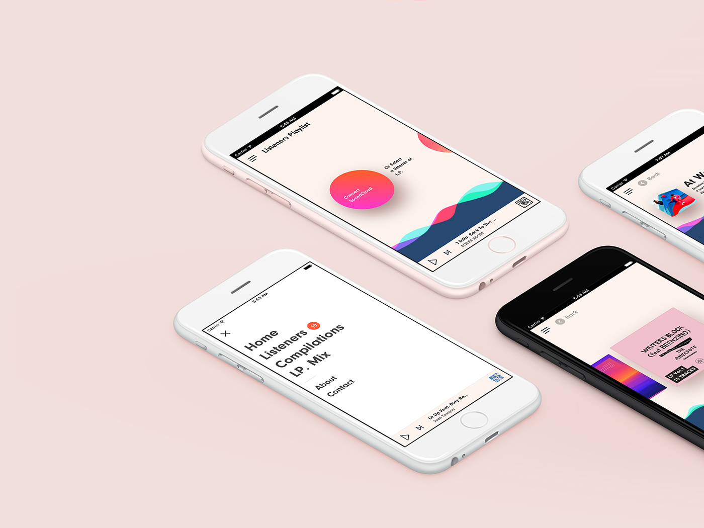
Keeping the colours to a minimum helps keep the shapes clean and the edges sharp. This really benefits the user as it means that less information is lost in the confusing appearance of a UI. People are able to get the information they want instantly without confusion and progress on with their lives quickly. Some may argue that this approach is a bit childish, plain and boring, however, I’d say that this is definitely a step in the right direction and something I should follow when it comes to my design.

Something to consider when designing an app is legibility so keeping words to a minimum is incredibly useful, as well as this choosing the right font with appropriate spacing between lines and letters can make all the difference. As people may be of different reading capabilities, it’s also important to establish icons as they would help someone should they not be able to read. Clear icons that portray either a simple visualisation of the connected material or are already universally accepted make for a much more approachable interface.