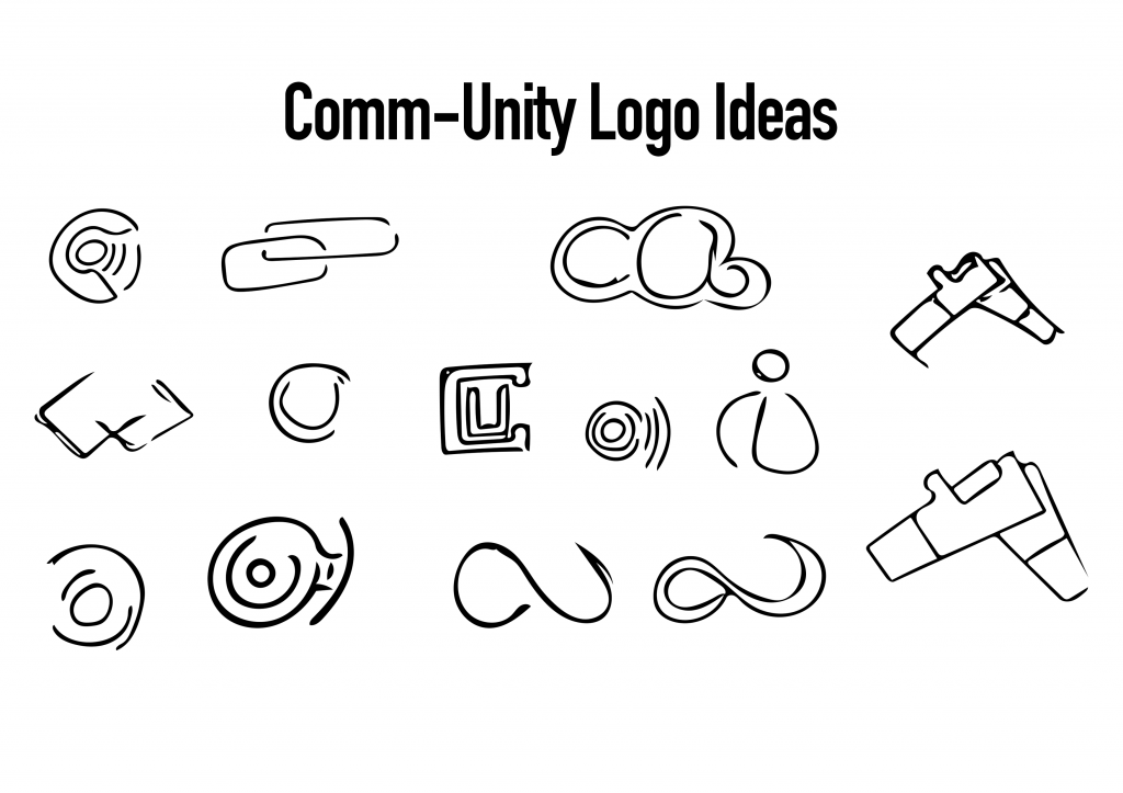
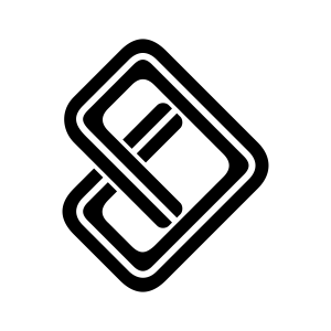
Following the research into logo design, I set up on designing a logo for myself. For Comm-Unity, as the name would suggest, it’s about linking local communities. Because of this, I started looking into potential signifiers of this. I looked at hands held, supporting one another as well as a linked chain which finds it’s strength through its links. I also considered the whole online database factor of the app and so considered the cloud, however, I feel like clouds have negative connotations of rain and sadness. Seeing as one of the products I wanted to make was a physical ‘beacon’, I based it around that, with a C and a U formed around the central node and then the wireless signals and information being emitted from it.
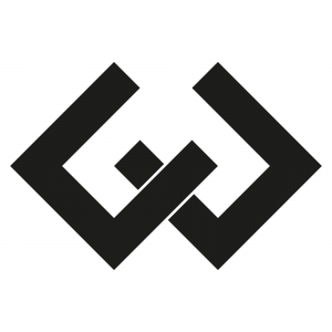
One of the designs that stood out most was this one, which I have since realised in Illustrator. After asking some of my peers, they also agreed that this was the cleanest one and most visually appealing. I’m inclined to agree. The clean shapes and sharp edges provide a modern and sophisticated appeal whilst also maintaining a symmetry which keeps the design balanced. With the overlay, it appears as though it’s two objects, linked together or unified.
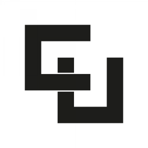
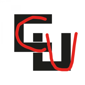
It actually started by forming a ‘C’ and a ‘U’ which were then rotated to form the symmetrical balance of the logo. Something about it though felt quite off, almost as though it was too aggressive with the straight edges and sharp corners. It also felt like it was lacking something, almost as though the design itself was quite lazy, I just didn’t think it fit the message of the project. That being said, parts of this can be seen within the final logo:
As you can see here, the C and the U are more prevalent, however, they have been linked together and rotated the other way in order to form and arrow, a signifier of both direction and progression, two of the objectives of the project itself. As well as this, I have rounded the corners of the logo which provide it with a much more welcoming look. In order to break up the box look of the logo, I added a line in the centre of the path which splits up the logo and makes it appear as though it were a road or a trail, a signifier of travel and exploration, the main focus of the project.
